*This section explains the rationale behind the brand concept, highlighting the typography used for both headings and subheadings, along with the specific font details. The GIF showcases the color variations throughout the project, including the hex codes for each color."

*This image showcases how the brand would be applied to stationery items, including business cards (front and back), pens, letterheads, and more.

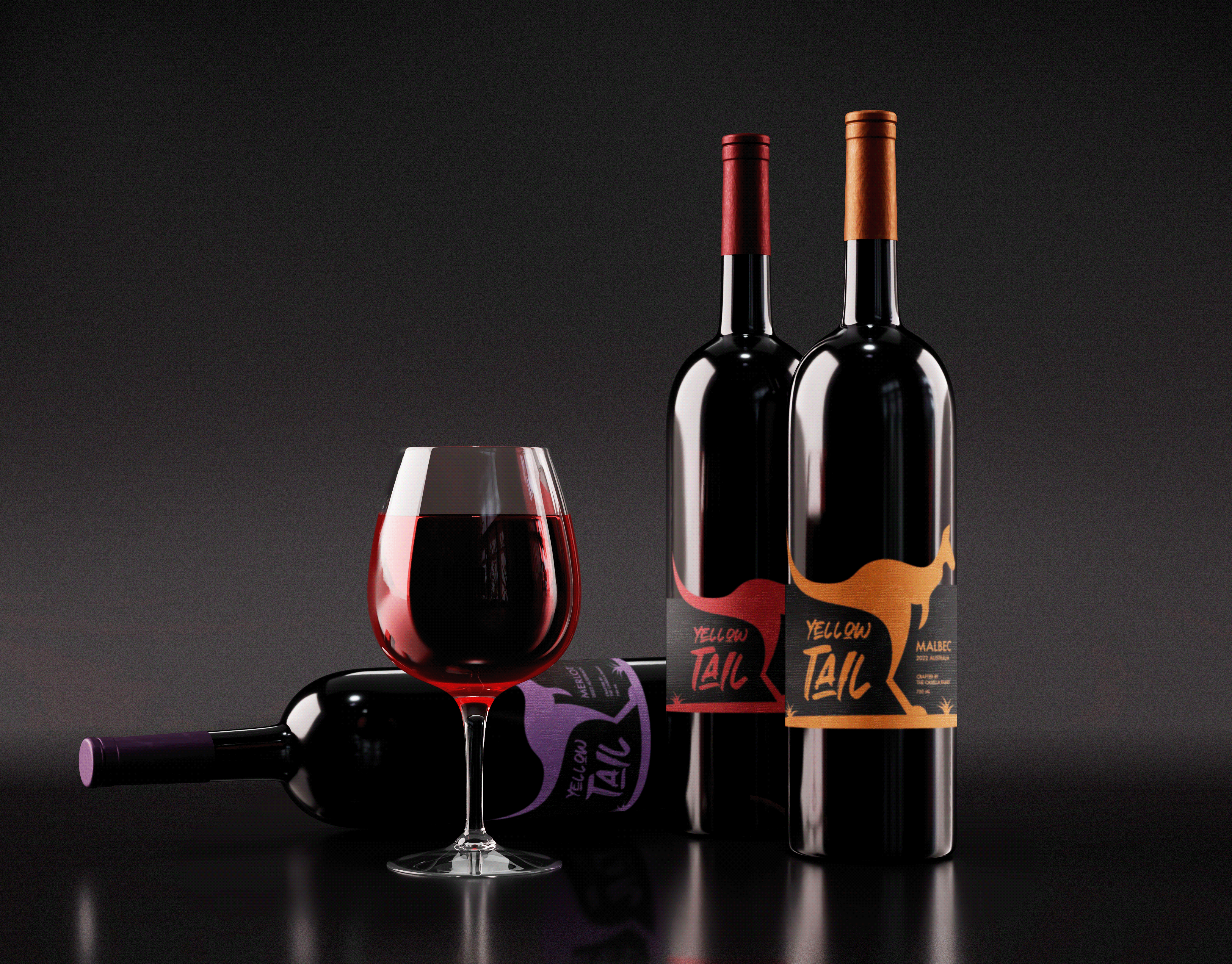
*Packaging design plays a key role in this project. The dog food packaging is designed to align with the brand's identity while offering flexibility to showcase three different flavors. The products are presented together to highlight the cohesiveness and consistency across the packaging.

*The GIF is used in this section to better illustrate the similarities between each container, highlighting the cohesive design across the packaging.


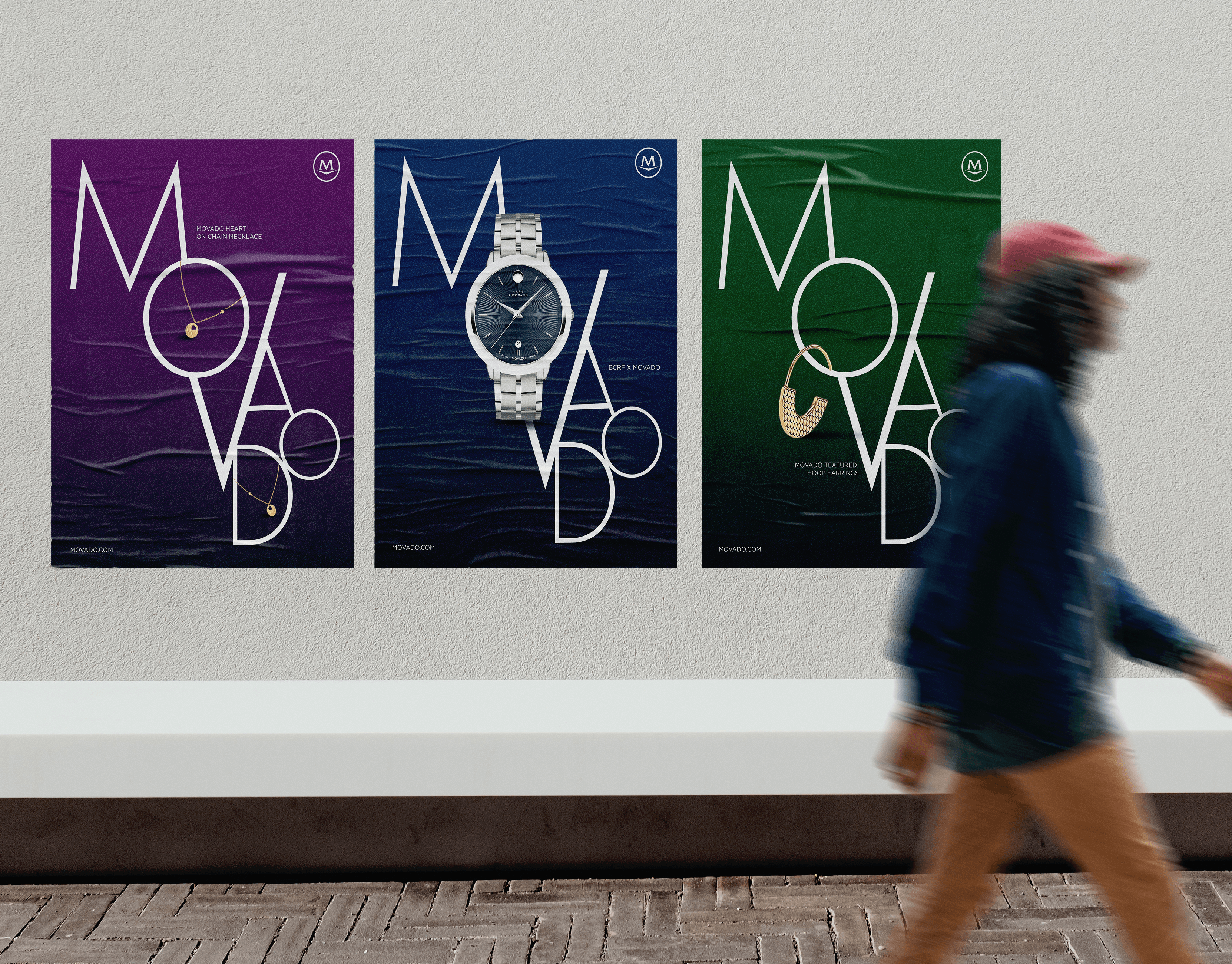
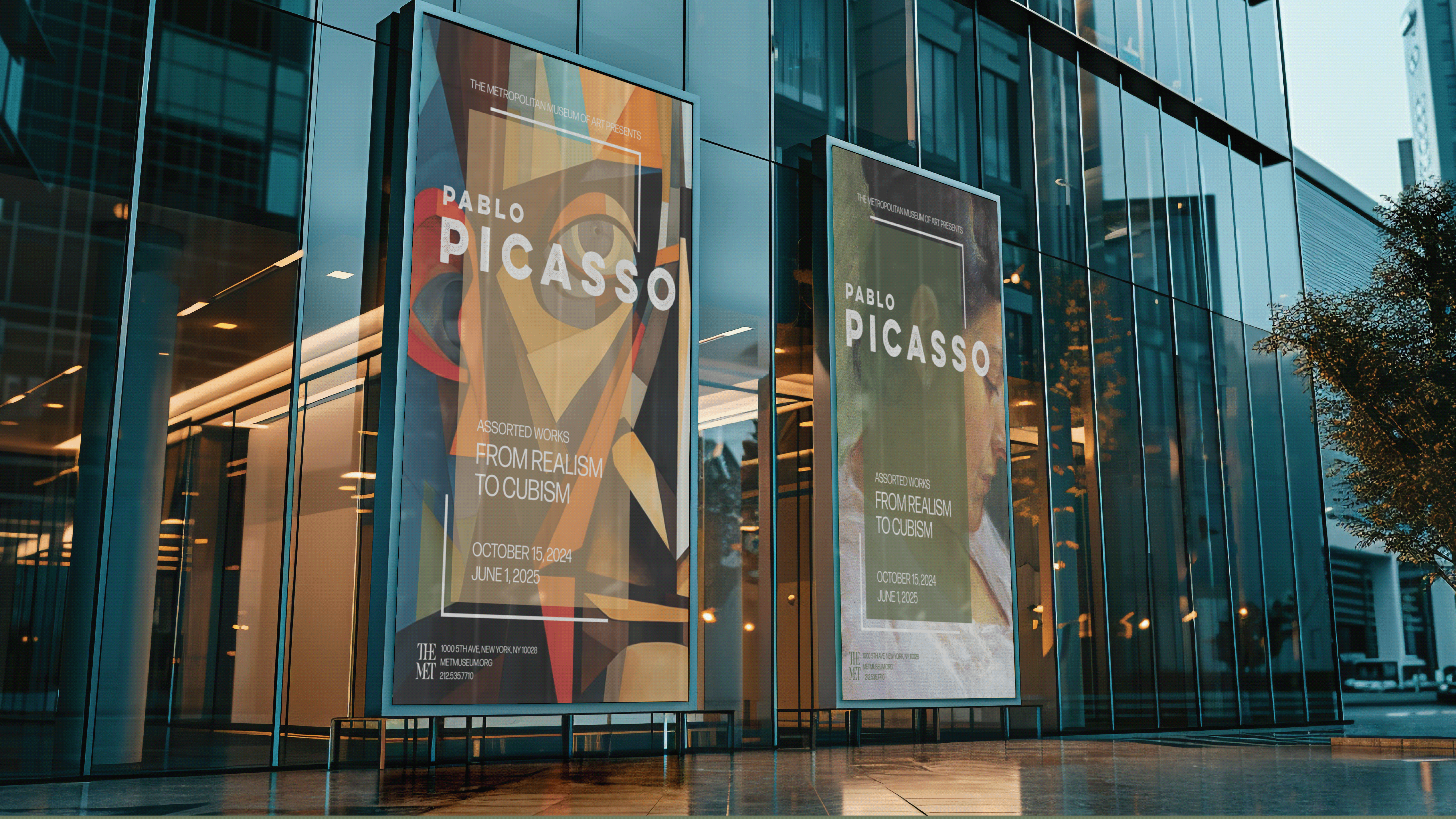
*These posters were designed for brand promotion and can be adapted for various uses, from street-level posters to large billboards. The consistent design across all pieces creates a cohesive collection that strengthens brand identity and visual impact.


*An additional element to the brand: the design of a machine that allows consumers to visit their local pet stores and reuse their previous bags to receive more dog food. This sustainable concept not only reinforces the brand’s commitment to eco-friendly practices but also creates a seamless and innovative experience for customers.

*Using Figma, I created a prototype of the machine’s user interface, showing how the screen would appear to consumers. The prototype includes a detailed wireframe that outlines the entire user journey, from start to finish. Additionally, I provided a video that visually demonstrates the full process, giving a clear, dynamic view of how the interaction would unfold.