*It’s important to clarify that this was a passion project, not a collaboration with Travel & Leisure.

*This showcases the front cover of the magazine featuring the new Travel & Leisure logo. Several design elements were added to enhance the layout, including a half-white border, decorative lines before and after the logo, and a carefully selected image that complements the magazine’s aesthetic.

*When designing the spread, the decision was made to feature one of the three stories highlighted on the front cover. "Italy in Two Weeks" stood out as an intriguing choice. The design mirrored the front cover’s template, featuring a thoughtfully chosen image that complemented the story, while the decorative lines around the title provided visual harmony and consistency.
*It’s important to note that the decorative lines surrounding the logo were designed to signal to readers that they are in a specific section of the magazine. For example, on the right page of the spread, the lines at the bottom indicate the "Destination Trip" section, where multiple articles share a common theme. This section is further distinguished by its signature purple color.


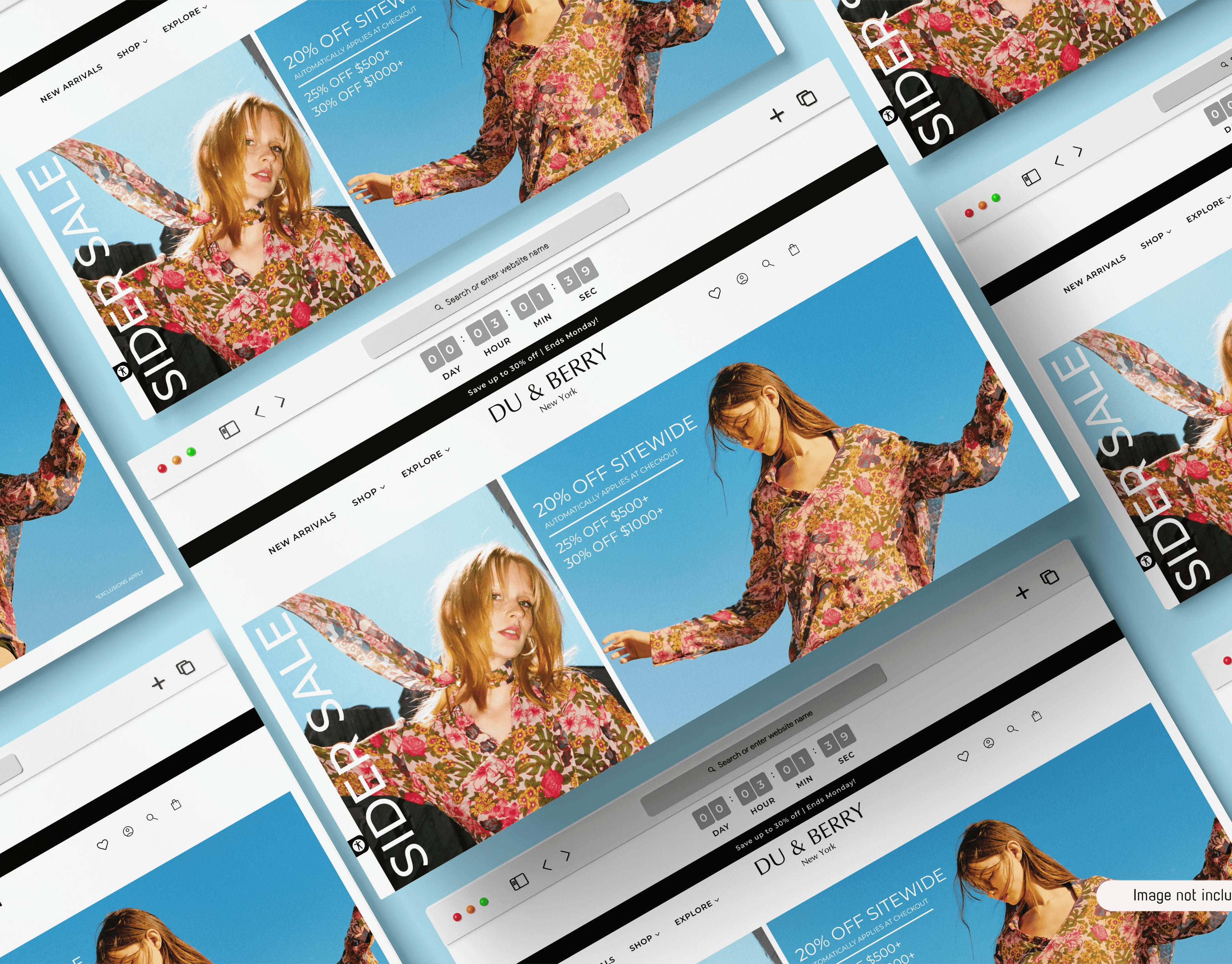
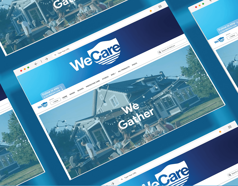
*The website was designed to mirror the magazine’s visual consistency. As users scroll down the page, they’ll encounter the first section category, showcasing related articles. The gif above illustrates how users can navigate by scrolling and also interact with the menu bar on the homepage, which provides access to other sections and categories across the site.