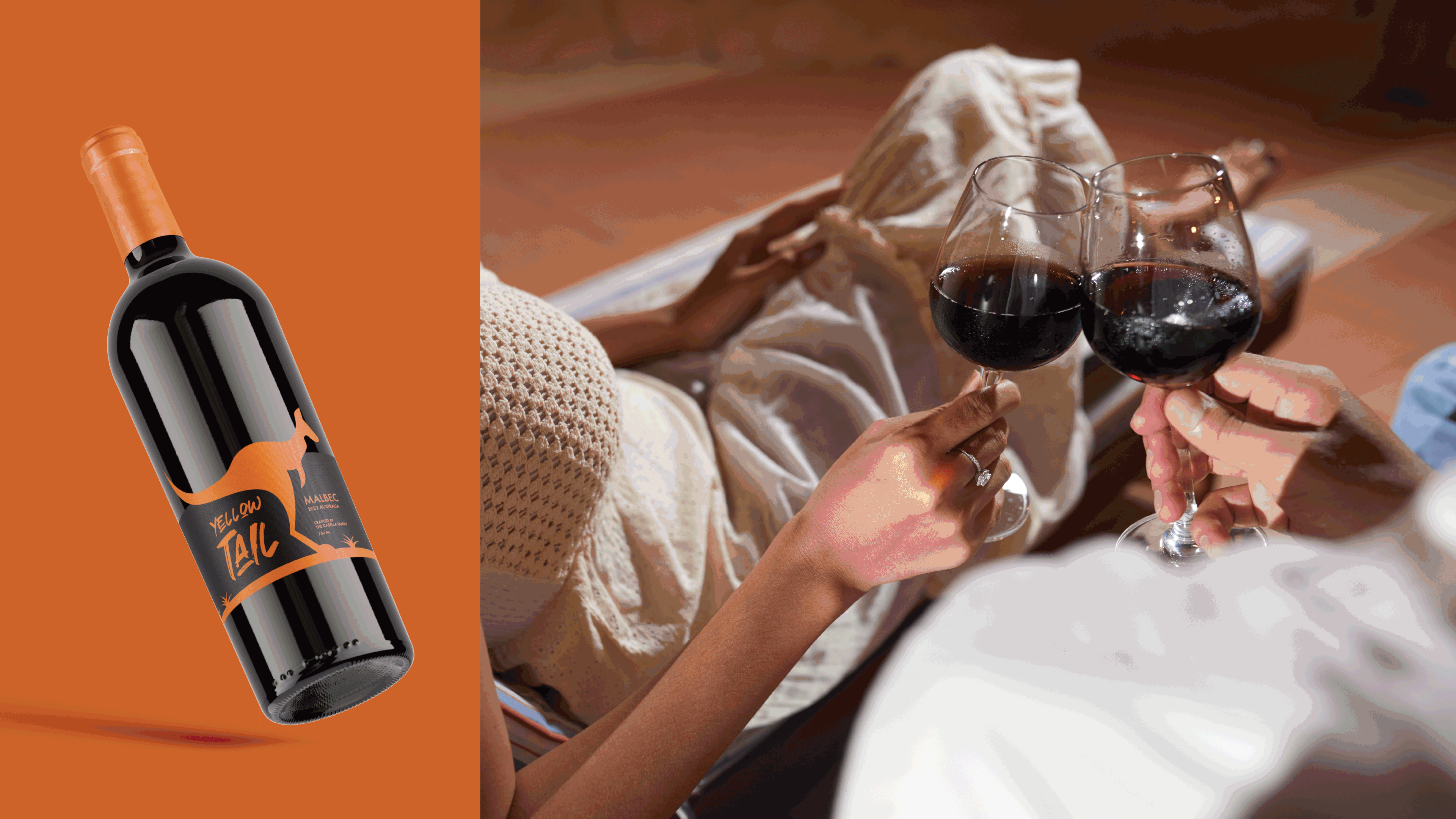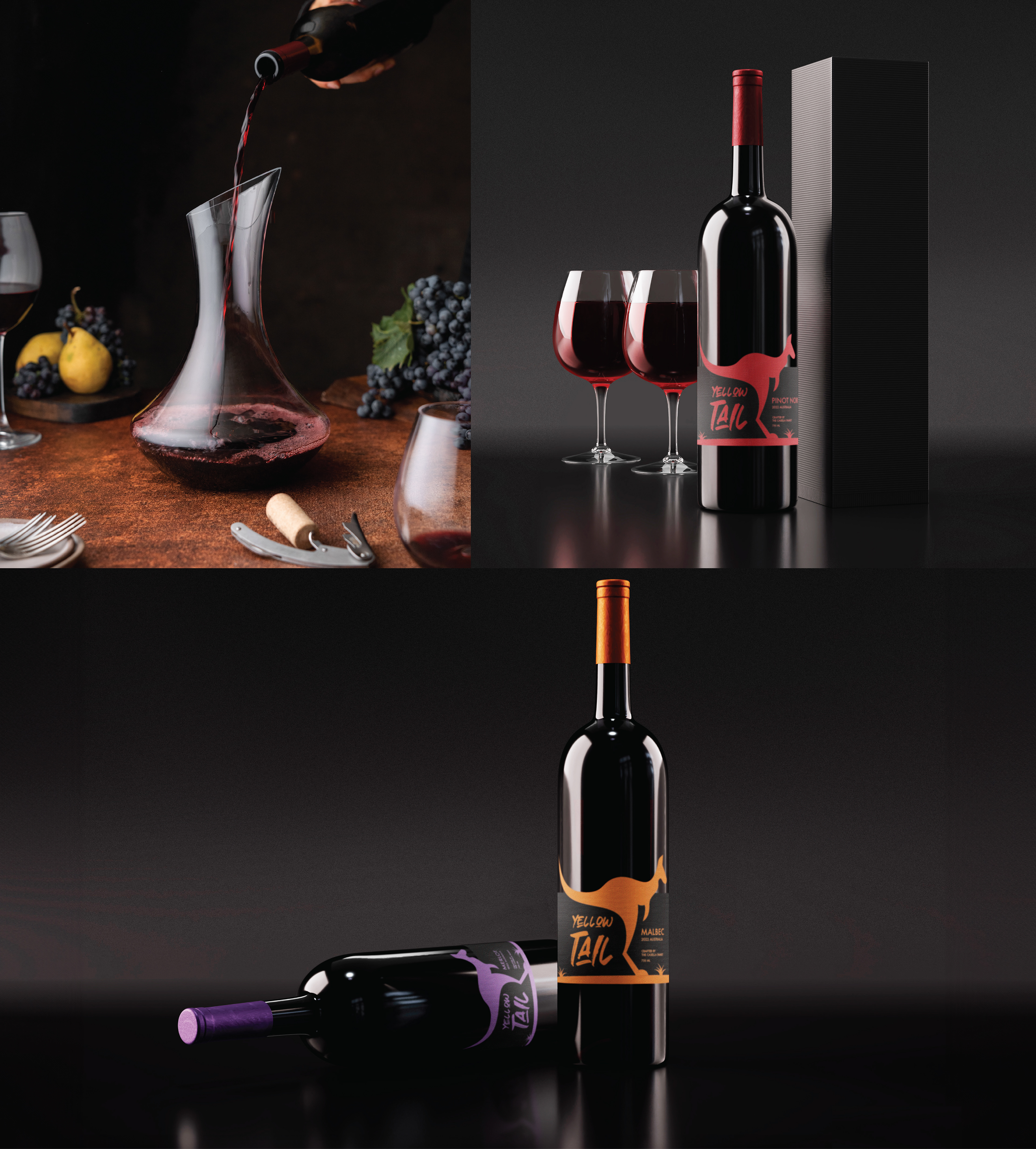
Yellowtail
Redesign ✶ Packaging
Through a continuing education course at the School of Visual Arts, I challenged myself to strengthen my graphic design skills through a full brand reimagining. The project focused on rebranding Yellow Tail wine and designing three new bottles, each inspired by a distinct flavor profile: Merlot, Malbec, and Pinot Noir. Much of the inspiration stemmed from the typography, which was intentionally very different from the original logo and chosen to better capture the wild, energetic spirit of a kangaroo. This project became a hands-on exploration of how typography can shape personality, visual storytelling, and a cohesive packaging system.